


LOGO, POSTER + FLYER DESIGN
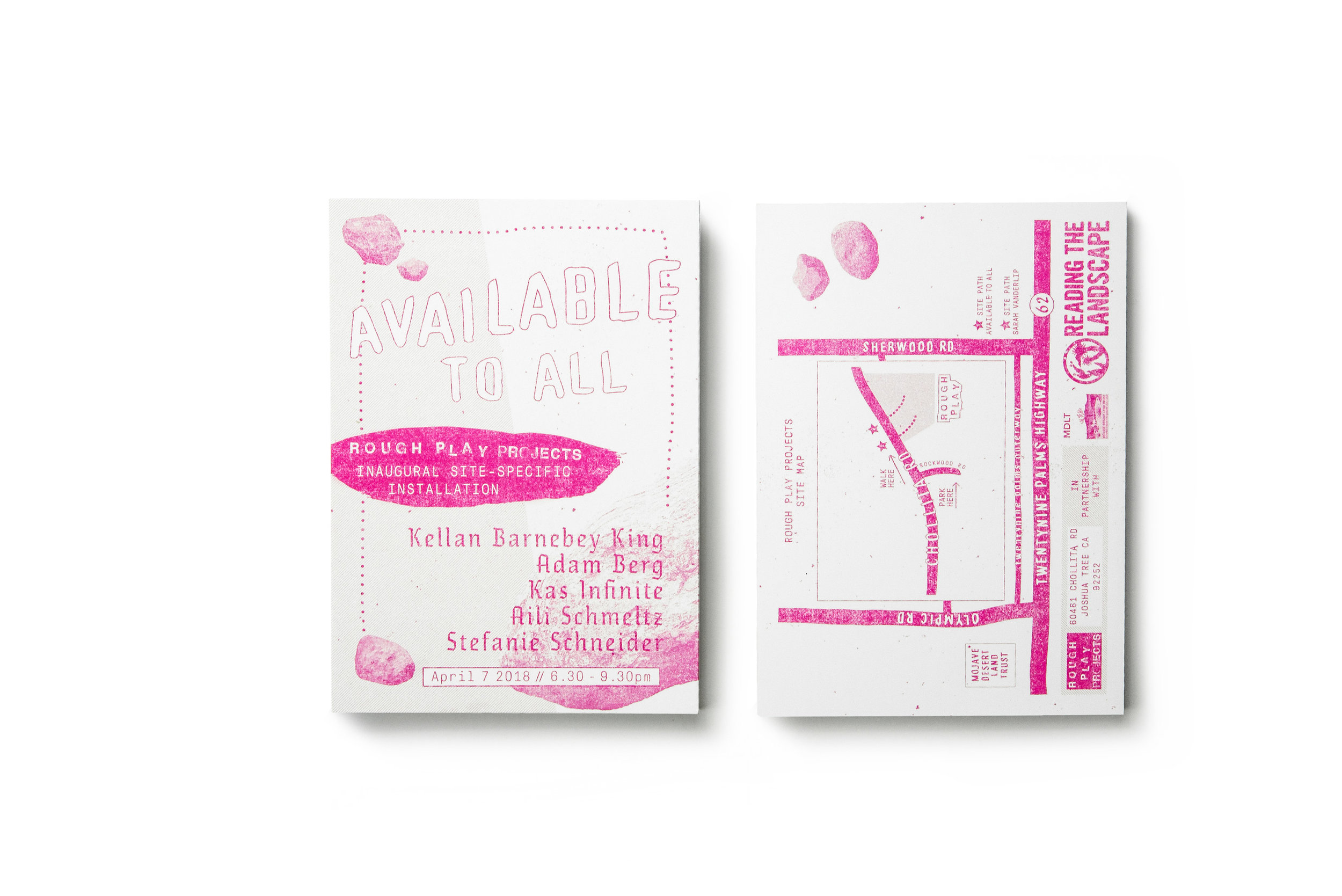
The poster was designed for an exhibition of artists whose work are complimentary to or informed by the land. Rocks and sand are constants on the landscape and in the outdoor gallery setting they form the context in which the work is shown - akin to white gallery walls and plinths. I used rocks as the only identifiable visual element to communicate the setting, and a sand texture overlaid to continue the land theme.
The dotted line (used as outline) is a graphic nod to the rock-lined path for attendees to follow to view the artwork and indicative of something fun. Title lettering is rendered by hand as are the artworks – hand letting really just had to be present and prominent. Other hand-drawn elements are here to further support the notion that this is an art show.
The incorporation of vector elements (type, pattern, date/time box) creates needed visual balance and graphic sophistication but also reflects that some of the artworks in the show do incorporate